A Tale of Two Website Accessibility Audits
I recently completed two website accessibility audits – one for a site built on Shopify and one for a site built on Elementor/WooCommerce. Both sites had very similar issues, many of which stem from the design.
Table of Contents
Background
It’s estimated that 16% of the worldwide population experiences a disability, including 40 million people in the United States. Pew Research Center reports that 67% of people with disabilities have a home computer, 72% have a smartphone and 47% have a tablet. But despite the number of people with disabilities who go online, 90% of websites pose significant challenges to use for people with disabilities. As a result, lawsuits are on the rise, especially for e-commerce websites.
Website Accessibility Audit Methodology
Both sites were tested using WCAG 2.1 AA criteria. Since WCAG 2.2 was about to be published (it was officially published two days after I finished the second audit), I also tested the sites for the 2.2 criteria.
I used a combination of tools and methods to review each site, including Equalize Digital Accessibility Checker, axe Dev Tools, NVDA screen reader, manual keyboard testing, and manual code review. For each site, I evaluated the global header and footer, the homepage content, a generic content page, a standard form, the main store landing page, an individual product page, and the shopping cart and checkout pages.
Top Issues
Many issues were consistent across both sites and were largely due to the design/theme or content entry, which means they could be remediated.
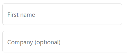
Color Contrast and Use of Color
Every page on both sites had an instance of insufficient color contrast or an instance of using color as the only method distinguishing an element. This can cause problems for people who are color blind or have low vision. Insufficient color contrast can happen between all of the following: button color and button text, button color and page background, standard text and link text, text over top of an image, and form fields and page background.
Examples of Color Contrast Issues


Alt Text
Almost all images on both sites lacked alt text or the alt text was not an adequate “text alternative”. In some cases, you could argue that the images are “decorative” and do not require alt text, but in the case of products, images should have alt text that describes the product (don’t just repeat the product name) so non-visual users can understand the product.
Headings and Heading Order
Screen reader users (and search engine crawlers) use html headings to understand the structure of your content. Think of your web page as an outline. If you take away all of the visual elements, it should still make sense.
Your page title should be the only level 1 heading on the page and it should be the first heading that is encountered in the code. Major subtopics should be level 2 headings and lower heading levels should be used for sub-subtopics. Don’t skip over heading levels.

On both sites, headings were missing and/or used out of order. For example, a level 5 heading was used as the very first element on every page because it had the visual appearance that the designer wanted.
Links v. Buttons
In HTML, links are created using an “a” tag, while buttons are created using the “button” tag. Links are meant to send the visitor to another page. Buttons are meant to initiate some form of behavior when clicked. Links should have text or a label that tells a screen reader what the link is for or where they may expect to be taken if they click it. Buttons used for opening and closing menus and accordions need a label that tells the screen reader user what function the button provides.
In the case of both sites, there were instances of links without text, links used for something other than navigating to a new page, and buttons without labels.
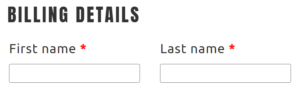
Form Fields Lab, Labels, and Errors
A number of errors fall into this category, including missing field labels, missing indicators for screen readers that fields are required, no notice to screen readers that the form was submitted successfully and visual error indicators disappear once you scroll on the page. These errors are really usability issues for everyone.
Focus Indicators
For visitors who navigate a web page using only a keyboard, there needs to be a visible indicator to show which element they are currently on. It’s very common for designers to disable this indicator which causes huge usability issues. The focus indicator should be a contrasting color online around the element that is at least a couple of pixels wide.
Sticky Headers and Text Resizing
Sticky headers that stay visible as you scroll down the page are very popular. However, they become problematic for users who manually increase the font size in their browser to make text more readable. When not coded properly, the sticky header ends up covering the entire screen making the whole page entirely unusable. This was the case on both sites.
Platform Specific Issues
In general Shopify and WooCommerce have done a good job to make their platforms accessible. Most of the issues on the cart and checkout pages were still a result of the chosen design. However, there were a few platform-specific issues.
Shopify Accessibility Issues
- Two of the “Express Pay” options launch new windows. When launching the Google Pay option with a keyboard, the popup does not receive focus and there is no way to add payment info or close the popup. When launching Meta Pay with a keyboard, there is no way to close the popup.
- The question mark icon button next to “Shipping” does not have a label to say what it’s for.
- Information about the products in the cart is only presented visually. This information is not read by the screen reader.
- On the checkout page, the focus is immediately moved to the email field. Keyboard users would have to tab through all items or use other keyboard codes to reach express pay buttons above the email field. For a screen reader user, the Express Pay options are not even announced so they wouldn’t know those options are there to navigate to.
- In the multi-page style for the checkout, the breadcrumb navigation links and ability to change the information from the previous screen is not read to a screen reader user so they wouldn’t know those options are on the page.
Most of these issues could be remediated with Javascript or by using the one-page checkout style. It may not be possible to remediate the issues with the Express Pay buttons. If accessibility is important for your site, you may want to leave these off or warn users about the limitations associated with these options.
WooCommerce Accessibility Issues
- The Cart page does not have a level 1 heading.
- The field to enter a coupon code does not have a label.
- Required fields on the checkout page are only marked with an “*”. There is nothing to say that “*” is used to indicate that a field is required and there is nothing in the code that tells a screen reader user that the field is required.
- The mechanism to enter a coupon code is a link when it should be a button.
These issues can be remediated with Javascript.
Conclusion
It is estimated that 90% of websites currently have accessibility challenges like the ones listed above. Most issues can be solved by making better design decisions from the beginning, choosing a platform that has been coded for accessibility, and following best practices when adding content. For almost everything else, there’s javascript!
Website Accessibility Services
If you would rather let someone else make your website accessible, Elevage Digital offers Website Accessibility Audit, Remediation, and Accessible Website services. Request a Quote today to start the conversation.